Free Printable: Thank You Mask for Frontline Workers
/Download your free printable to give thank you masks to your amazing delivery drivers and frontline workers!
Read MorePhotoshop Tutorials & Inspiration for Beginners
How To’s, Inspiration, and Resources for Aspiring Photographers, Designers, Content Creators, and Crafters
Download your free printable to give thank you masks to your amazing delivery drivers and frontline workers!
Read MoreCheck out how easy it is to make this quick holiday card using a couple of this week's freebies from Creative Market! Grab your copy of Bernal Sans Typeface and this Merry Christmas set, and let's get Photoshopping!
 In celebration of Zé's first Halloween and the lumberjack hat/beard I crocheted for him, I put together the above graphic and thought it'd be fun to share how I made it.
To accomplish the clean white background, normally I would shoot on white seamless (lit to delicious pure white perfection), but my studio gear is currently packed in moving boxes (yes, still), and I didn't want to mess with setting up hot shoe flashes, so I put together this low-tech and super easy solution using only available light (and set-up took all of 30 seconds!).
I photographed him on 30x40 white foam board (sold in a 10-pack which is GREAT because they are handy for so many things!), sitting about where you see the dragon in the photo below. I used one piece for him to sit on, another behind him (propped up by a basket), and a third piece opposite the window to bounce the light and fill in some of the shadows. You can see the set-up in the photo below.
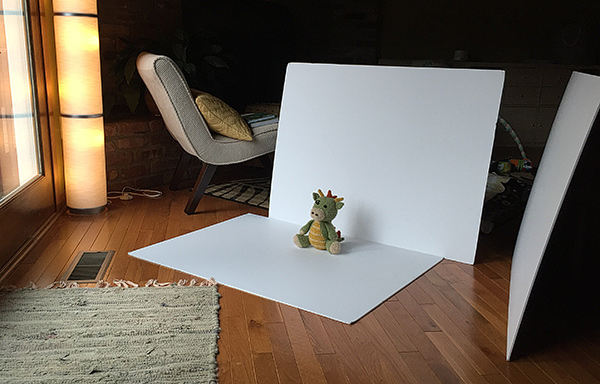
The photo below is the result straight out of camera (SOOC). Because I was using only available window light coming from the front/left, I wasn't able to blow out the background by over exposing it the way you easily could in the studio. Thus, we can see the seam where the floor board meets the background board, requiring a small adjustment. (And, that's our wood floor peeking out from below the foam board at the bottom of the photo.)
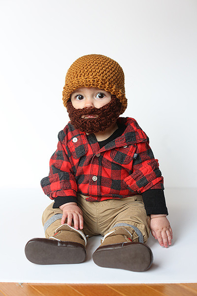
I used the Dodge Tool (O) to clean up the background, paying special attention to the seam where the two boards come together. To fix the floor, I used the Eye Dropper (I) to sample the white near the bottom of the foam board and the Paint Brush (B) to simply paint over the wood floor.
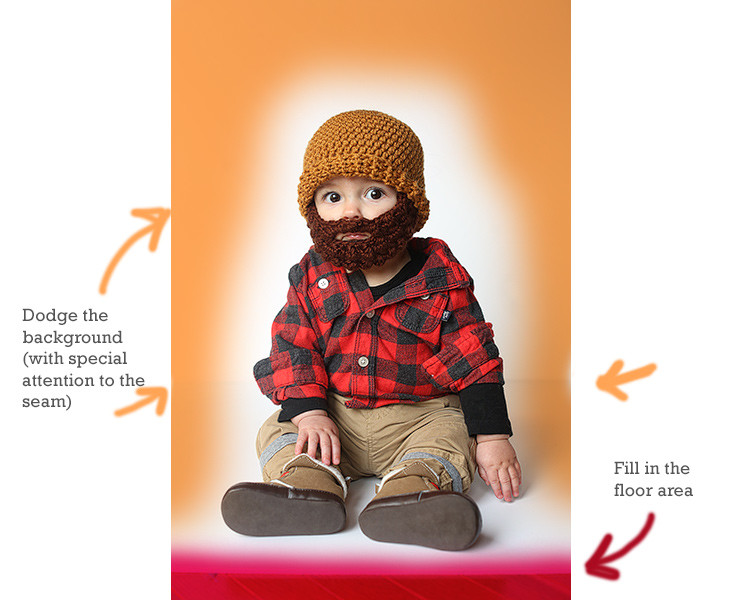
Working with white backgrounds can be tricky when you're not shooting them in the studio. Dodging can make things appear to be in order, but if you view the image on various screens from certain angles, you might see your brush strokes. To prevent this, I like to add a temporary Levels Adjustment Layer which I purposely destroy with a severely exaggerated midtone adjustment, which shows me any spots I may have missed with the Dodge Tool, as seen below. To fix any errant background information, I simply dodge the background layer while the Levels Adjustment Layer is still active, effectively checking my work as I go. When I'm finished, I drag the adjustment layer to the trash.
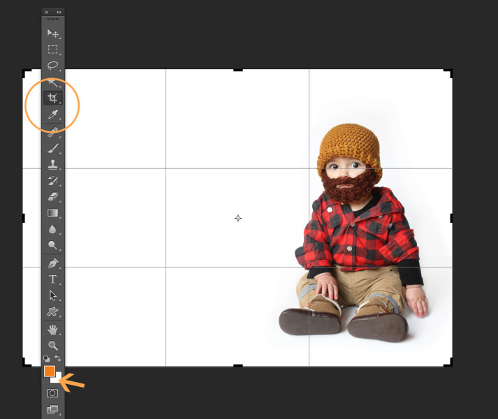
 Once the background was cleaned up, I used the Eye Dropper Tool and Option/Alt clicked to load the white background color as my active background swatch. Then, I switched to the crop tool to resize the whole image. (You can leave the settings blank and just drag from the corner to visually adjust the canvas area, or enter specific dimensions if you know what size you want the final piece to be.) Photoshop will fill in the canvas area with whatever color you sampled for your background swatch when you Option/Alt clicked with the Eye Dropper. This makes it possible to use the crop tool to essentially reformat the image and extend the background, creating room for our design. If you did a good job of cleaning up the background area, it should appear seamless.
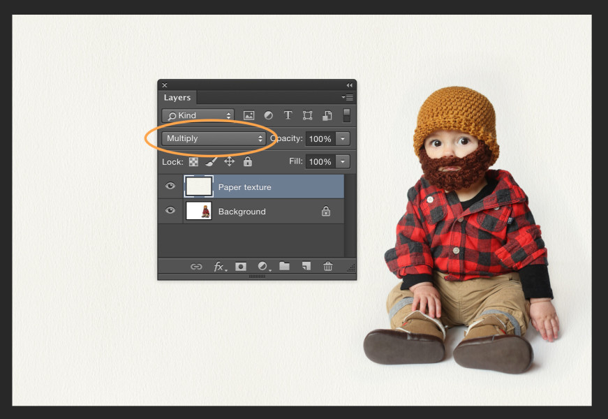
To create a more organic feel, I opted to add some paper texture to the design. You can use any kind of texture file you want. I used paper48.jpg from this Give Me Some Papers Quick texture collection by Nicky Laatz. After making sure the texture file was sized appropriately for my image, I dragged it into the composition and changed the layer's Blend Mode to Multiply.
Next, I added two text layers using Monster and Rockwell typefaces and used the Eye Dropper Tool (I) to select the text colors from within the image itself. Finally, I added the spider web graphic (again, changing the layer Blend Mode to Multiply) to finish the design.
 And that's it—frightfully simple!
These two lovebirds were not only great to work with, but they let me live-edit their session on-camera in front of the global Creative Live audience! Thanks again guys!


In the spirit of Valentine's Day this year, I put together a fun little tutorial over on the creativeLIVE blog explaining how to make this cute desktop wallpaper design. Enjoy!

After milking the last drop of usefulness from my old MacBook Pro, I finally bit the bullet and upgraded to a new (Retina) model. One of the things I was most looking forward to was the ability to restore balance to Emir's AppleTV access from his MacBook Air (my old MacBook was too old to support AirPlay). After migration was complete, I was super bummed to discover a missing AirPlay icon. Was Mavericks buggy? Was I an idiot? Countless web searches revealed similar problems but surprisingly, somehow, I couldn't find the solution. (I could still stream via AirPlay, but only by manually manipulating my Display Preferences, not via the shortcut icon.)
"Call Apple Support" was on my to-do list for weeks. I finally bumped it to the top of the list. Turns out, the solution was embarassingly simple, and I had been painfully close to discovering it on my own, but had always had both settings set to the affirmative, and that was the problem.
Counterintuitively, the trick is to leave "AirPlay Display" set to off, while turning "Show Mirroring Options" on. Am I the only one who missed this? Why wasn't it set on by default? (Maybe due to migrating from a non-AirPlay enabled MacBook?)
Either way, if you find this helpful—you're welcome. :)
 If you're in any way connected to the creative industry, you've surely heard about Adobe's Creative Cloud by now. And if you're like a lot of people, you're still not entirely sure exactly what it is. In a nutshell, it's a new way of accessing Adobe products and it comes with various benefits, but it requires a bit of a paradigm shift. Allow me to explain...
Up until now, you purchased Adobe products either alone (such as buying just Photoshop by itself), or as part of a collection (which would include several bundled products like Photoshop, InDesign, Illustrator, Dreamweaver, etc.). You would then own these for as long as, well... forever really. The products were either shipped to you in a box with an install disc or you downloaded them and carefully stored the serial numbers somewhere for easy access in case you find yourself needing to rebuild your hard drive or migrate to a new machine.
The advantage of the old system was really just that you owned your software license outright for all of eternity, which allowed you to make a sizable investment (Photoshop just by itself ran around $700), and then use it for as long as you want. Regardless of how many new releases came out, you could hum along using your (now outdated) version to your heart's content. It was expensive up front, but you could get some serious mileage out of the software until eventually caving in and upgrading (which would usually be necessary at some point as older versions eventually aren't supported and making your computer play nice with other professionals in the industry often requires a somewhat current version, meaning that even the most stubborn among us can only hold out for so long).
The disadvantage was that upgrading always meant a bunch of time and more money, and as a result, it often got put off. Waaaay off. It wasn't uncommon for professionals to be limping along on software that was often 5 or more years outdated.
Additionally, because of the expense, people would often opt for only a single piece of software, bending the laws of nature in an attempt to make that one piece of software (namely, Photoshop) do things it was never intended to do like multi-page layout and design like wedding albums, product catalogs, and company newsletters—for which InDesign is far better suited. You name it, I've seen it happen. This was not only expensive in terms of the extra work and hassle it created, but it held people back from developing new skills on new software platforms. And to put it quite simply, it was just plain painful to watch. I used to teach Photoshop on a seminar circuit and when I learned that people were using Photoshop to build annual reports and such, I was nearly speechless and felt like crying on their behalf. What a nightmare! But that's what happens when upgrading requires an act of Herculean strength to move corporate and bureaucratic mountains just to get budgets approved, etc.
Enter Creative Cloud.
Adobe's new subscription based plans mean that for less than $600/year (substantially less for new subscribers, and students/educators/teams get special discounts too), you can have the latest and greatest version of not only Photoshop, but the entire suite of Adobe products. And instead of owning a box with an install disc, you own a web-based license which enables you to download any and all of Adobe's products and use them for as long as you maintain your subscription. Upgrades and updates happen automatically.
This makes it easier to budget (your finance department will thank you!) and comes with a whole slew of benefits including:
The paradigm shift In essence, instead of "owning" your Adobe products, you're effectively "renting" them. This is the paradigm shift you'll have to make in order to cross over into the new and fluffy world of cloud licensing. From people I've talked to, this is the part that feels difficult to swallow. I too prefer to own rather than rent in most cases, but when it comes to having access to all the software in the current version, plus all the added benefits, I'm willing to shift my paradigm.
RequestsThe "cloud" is new for Adobe, and surely it will take time for people to cross over and in the meantime, I imagine that Adobe will continue to refine the way it all works.
Personally, I'd like to also be able to pay a year at a time rather than monthly. It works out to be the same either way, but psychologically I'd rather pay in a chunk rather than every month.
I'd also like to see a reasonably inexpensive way to add a small number of additional licenses (for a family, not just a team office) to avoid having to pay all over again in order for kids/spouses to have access. (Currently, each subscription comes with 2-licenses, which may work well for many people, but when Emir and I each have a desktop and a laptop, we need a minimum of 4. Or, I suppose we could evolve to work exclusively on laptops? It's a possibility I guess...)
Either way, I look forward to how the cloud continues to evolve and the new opportunities it creates for creatives. :) Onward!
Are you still scrambling to put together your holiday card? Fear not! Not only do I have a stellar recommendation on where to have yours printed, (Mpix, Mpix, Mpix!), but I also have a FREE customizable template for you! The template comes in two sizes: 8x4 photo card, or 4x5.5 flat card (vertical). But wait—there's more! I even have a tutorial video showing you how to use Photoshop Elements or Photoshop CS to drop your own photo into the design and how to get your groove on with Mpix. Check it out at the end of this post, and click here to download the zip file that contains the .psd templates.
Enjoy!


As much as I love Apple, I do not love managing/downloading my photos with iTunes or iPhoto. But—I also don't want 3 years worth of images bogging down my phone. What's a girl to do? Turns out, Mac users can easily bypass iTunes by using Preview. Just plug in your phone, launch Preview, and choose File>Import from iPhone.
Once the images are downloaded, you can also use Preview to batch delete photos from your iPhone. Pretty sweet, eh?
Now that you have tons more space for tons more photos, get out there and get to it already! :)
PS: Looking for more photo fun? Check out my post on how to give your mobile photos a life beyond Instagram and Facebook.
PSS: Windows user? Check out this great post made just for you!

(This post is part of a 2-part series on iPhone photo apps. The first was a round-up of my favorite iPhone photo apps.) Part of what makes our phone-cameras so handy is that they're with us everywhere. Most folks would agree that having a camera in your pocket at all times allows you to capture your life in a way that you never did before, including glorious sunsets, an especially amazing meal, laughable moments with our pets, and nearly every adorable thing our kids do. The ability to take photos at any given moment has the power to magically transform even the most mundane activities of daily life into photographic treasure, thereby allowing you to relive the fun at any time, while giving future generations a very insightful glimpse into your life. Pretty darn amazing.
Of course, if these photos never make it past your hard drive (or "the cloud"), in a sense—it's almost as if they don't really exist (for future generations at least). And what's especially tragic, is that sentencing your photos to a fruitless eternity spent decaying in the digital abyss of your hard drive is entirely avoidable Your phone, combined with Instagram, make it fantastically easy (even fun!) to give your images the chance to live on in the real world.
Below is a summary of various apps and websites I've used to ensure that my Instagram images will be around long enough to give our future kids an idea of who their parents were when we were young, or at least—to give them a good chuckle.
Blurb I love Blurb and make Blurb books on a regular basis. Perhaps the awesomeness of merging your Instagram photos with Blurb is best summed up in this great clip of multimedia journalist Richard Koci Hernandez.
Stickygram Who doesn't love magnets? Especially when they have your photos on them? Makes a great gift, and crazy fun to receive in the mail. Not sure if this code still works, but it saved me 15%: SOMETIMESSWEETPROMO Good luck!

Printstagram Prinstagram offers stickers, minibooks, and posters (among other things). The mini-books are fun, but aren't as large, robust, or high quality as a Blurb book. Of all their products, I like the stickers best.

Postagram Postagram makes it possible to turn one of your photos into a postcard, and send it from your phone. We used this service often while on the road with The [UN]tour. The results? Mixed reviews. Most of the postagrams we sent arrived without incident, but others were dramatically delayed, by as much as two months. Verdict? Still a very fun app. Just don't use it for something urgent or extremely important.
Fun feature? The photo "pops out" to easily be added to your recipient's fridge, bulletin board, etc.

PostalPix If regular old fashioned prints are what you're looking for, PostalPix is for you! Ordering is simple, directly from your phone.

Khara Plicanic. Instructor, Photographer, Designer, Advocate. Here you'll find tools, inspiration, and empowerment to help you on your own creative journey.
