Join Me on creativeLIVE (for FREE!)

Wedding Album I am crazy excited to be making an appearance on creativeLIVE and will have the opportunity to help photographers around the globe whip their workflows into shape!

The 2-day workshop will be broadcast on-line for FREE on Sept. 27th & 28th and you can sign up to watch here. (If you're in or plan to be in the Seattle area at that time, fill out this form for a chance to join me in the live studio audience. Selectees will be notified on Sept. 17th, so get the form in no later than the 16th!)

Here's an overview of what to expect—don't miss this!

A Few of My Favorite iPhone Photo Apps

The iPhone4 came to Sprint literally just in time for Emir and I to leave on our cross-country UNtour. (Our pre-ordered phones were delivered while I was shooting a wedding on Friday, just a day-and-a-half before we left town on Sunday—phew!) We dove right in and discovered a few various apps that have since become go-to favorites. Here's a quick overview. Instagram: This app is hands-down my favorite photo sharing app. In addition to being a social network all its own, Instagram also has it's own built-in filters/effects that make it easy to have fun with your images before posting them to share with the world. I also like that I can post directly from Instagram to Facebook and Twitter as well.

I'm not a fan of using Instagram to capture the photos though, as the built-in camera app leaves much to be desired. But it definitely is my app of choice for posting to the world.

Are you an Instagram lover? Connect with me! My user name is kplicanic.

PS: Instagram doesn't have a desktop interface, but you can use desktop apps like Statigram to view your feed on your desktop (though I'm yet to find a desktop app that lets you post to Instagram).
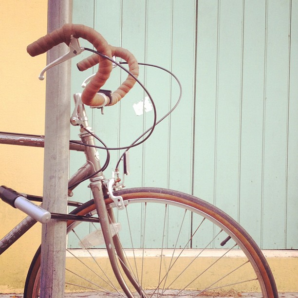
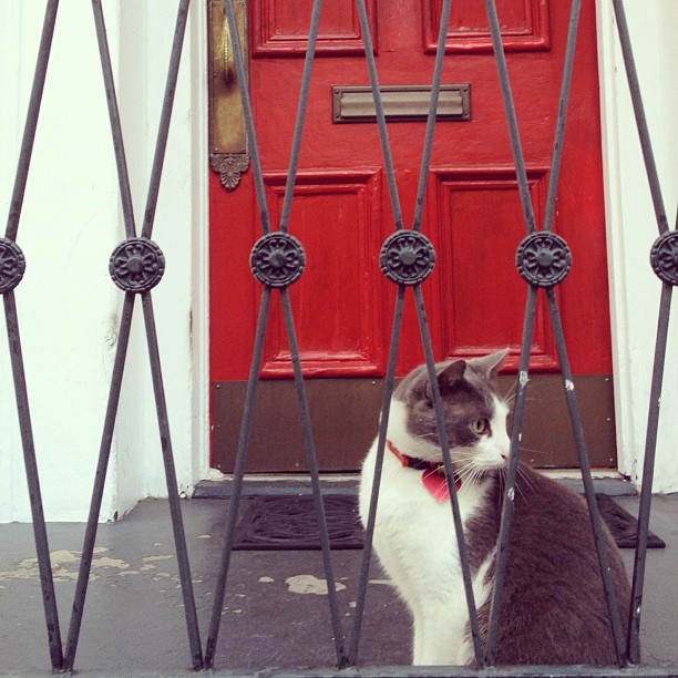
SnapSeed: This is my favorite app for actually editing the photos I take on my phone. It takes a moment to figure out how it works, but it is AWESOME.

DipTic: This is the app I use for most of my iphone collages. It's super easy to use and produces nice clean grids in a variety of layouts.
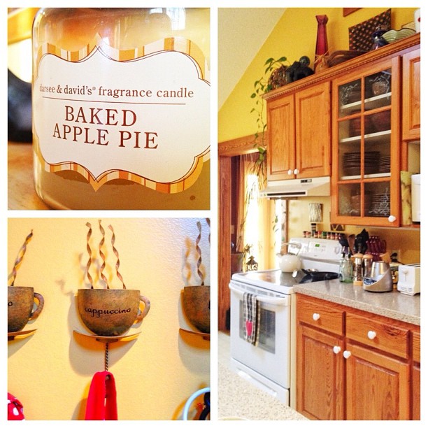
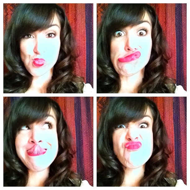
 

Camera Awesome: A simple app, Camera Awesome is a great replacement for Apple's built-in Camera app. Some people like Camera+ for the added control it gives you, but I have found it to be cumbersome and very frustrating to work with (not to mention that I don't care for the design of the interface).

Conversely, Camera Awesome does a great job of allowing you touch screen control over separate points for both your focus and your exposure, which isn't possible in Apple's built in Camera app.

Camera Awesome offers some processing options too, which is always fun. Having literally just downloaded the app, I haven't had the chance to play with them all yet, but it's looking promising. I'm guessing that this will be my go-to app at least for image capture, and possibly for processing as well.


Apple's Built-In Camera App It's not the most robust app, but when you're in a hurry, nothing beats the speed with which you can launch it. Did you know that when your phone is locked, if you just double-press the home button, you'll see the camera icon appear next to the slider bar? Sweet, right? Then, instead of dragging the slider bar to unlock your phone, you can just tap on the camera icon itself, and it will take you directly to the camera app. (This is the main reason why it's still the app I reach for first for image capture.)

UPDATE: The new iOS update has added the camera app icon directly to the unlock screen, whether your double-press or not.


Pro HDR Though I have definitely not jumped onto the HDR bandwagon, there are definitely occasions where certain images simply wouldn't be possible without it.

If you're not familiar with HDR, it stands for "High Dynamic Range." Because cameras aren't able to capture the full range of tones that we're able to see with our eyes, in scenes where there are dark shadows combined with very bright highlights, you're forced to choose which ones to capture, either the highlights, or the shadows. HDR images are created by combining two or more exposures (one for the highlights, one for the shadows) into a single image. They've gained a lot of popularity in recent years, but they generally aren't my style. But—when you find yourself in a situation that calls for a higher than usual dynamic range, Pro HDR is definitely the app to reach for!
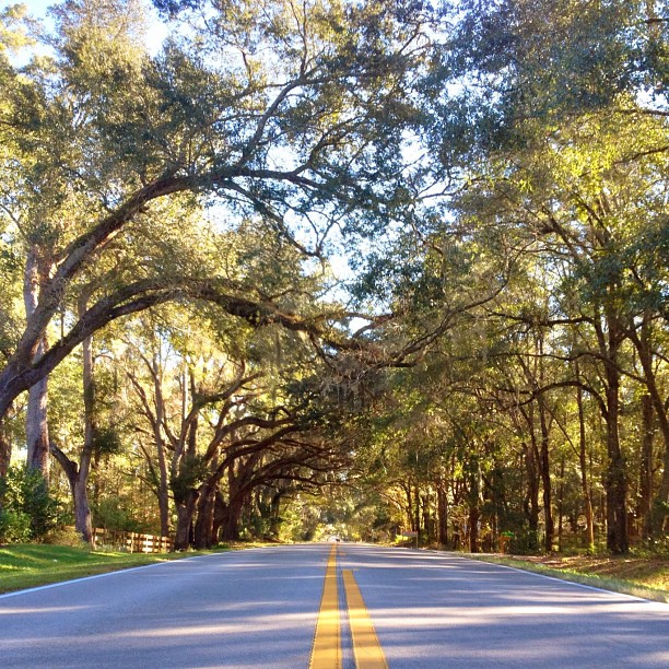
SquareReady As I already mentioned, I'm a pretty big fan of Instagram. One of the fun things about Instagram is that everything it exports is in a square format, which I'm also generally a fan of. But now and then there are some compositions that simply do not work as a square, and the only way to be able to share them in Instagram without having to crop them, is to prepare them ahead of time with something like SquareReady. It works by adding in a background  as "filler" so that the whole final piece (photo + added background) is a square. Then, it's ready for Instagram!

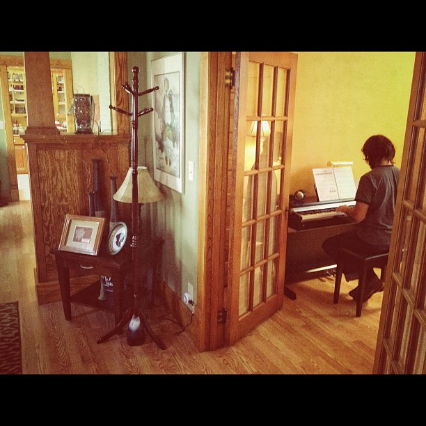
(It's hard to see in the image below because it was "Squared" by adding a white background, but you should be able to see a faint grey border around the edge of the image. In either case, the image below illustrates this more clearly with the addition of a black background.)
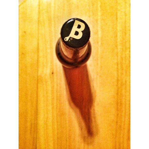
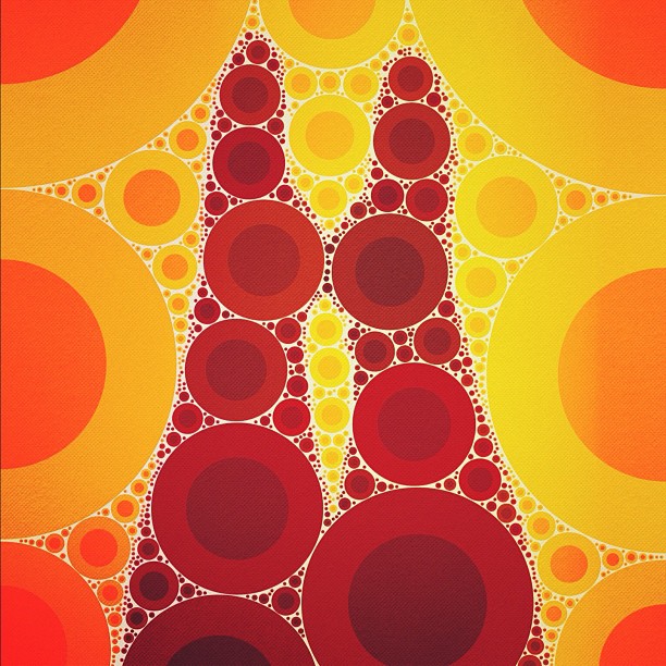
Percolator This app is just plain fun! You can use it to re-interpret your images in all kinds of various ways.
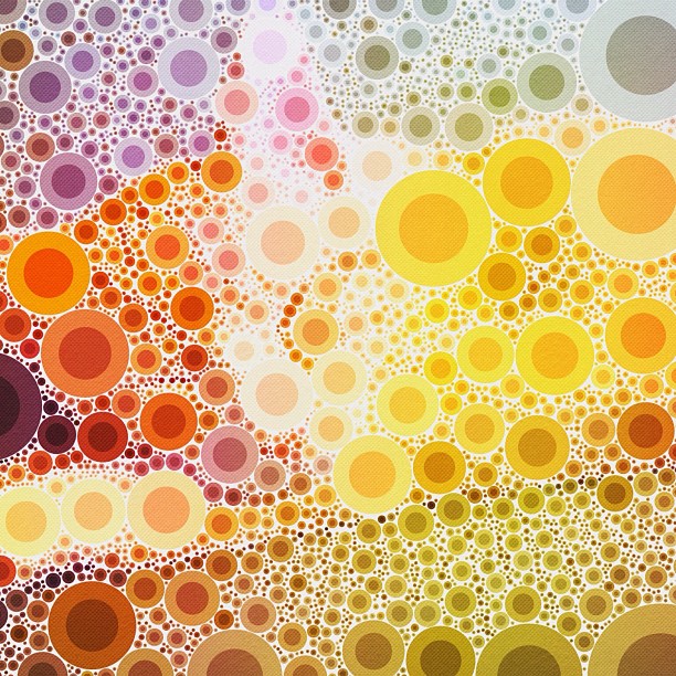
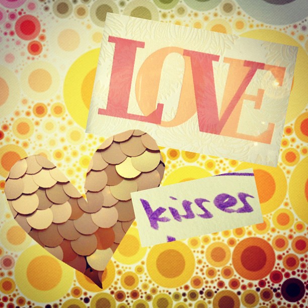
Montage This app is fun for combining bits and pieces of various photos into a single collage. It's amazing what you can pull off with just your fingers! (You'll notice that I used one of the above images created with Percolator as the background in the montage I created.)
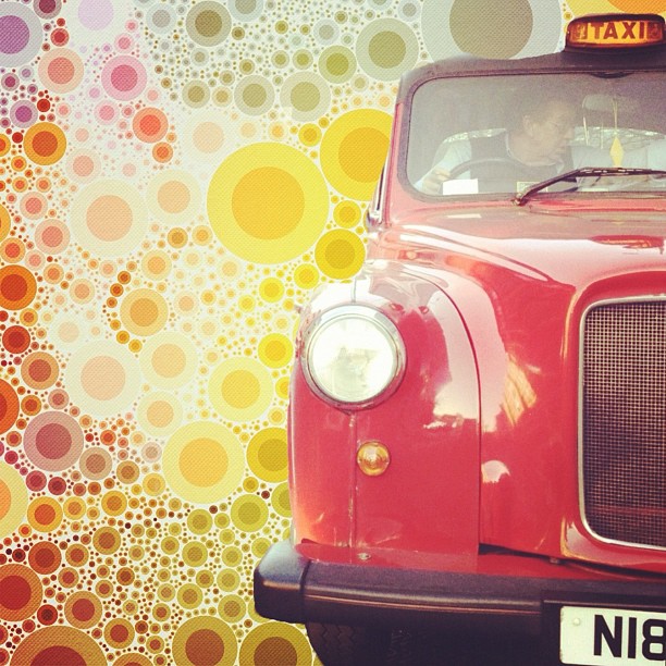
Juxtaposer Think you need your desktop to be able to remove backgrounds and combine images? Think again! This app lets you work with layers in a way that's very similar to Photoshop... all from your phone!

In the example below, I used the same Percolated background and added a photo of a British taxi cab that I shot while in London. (Not bad when you consider that I cut it out of the background using only my finger!)
A Word About iPhone Photo Workflow There is no right or wrong. The way you decide to work with you images will largely be decided by what kinds of images you're working with and what plans you have in store for them.

My current workflow is to capture an image on my phone using either the built-in Camera app, or the newest addition to my app collection, Camera Awesome. Then I open the image in SnapSeed, process it to my liking, save back to the Camera Roll, then share with the world via Instagram.

That said, every situation and every image is different (just like when I'm shooting professionally with my big girl camera). The more you play around, the more you'll find what works for you. Sometimes I build a grid with DipTic after using SnapSeed. Sometimes I use SnapSeed, then DipTic. And sometimes I just jump straight to Instagram.

Either way, the point is to have fun, so don't forget that! :)

Stay Tuned for Output Options! One of the things I stress in the various classes I teach is the importance of outputting our work and our memories. As awesome as it is to share our images on Facebook, Instagram, etc., for the sake of posterity, we really should be doing something more tangible. Stay tuned for a follow up post sharing some of my favorite ways to bring your iPhone photos to life!


Holiday Gift Idea: Learn to Love Your Camera!

Your camera loves you. Yes, it's true. And if you're still looking for a great gift idea, you should know that you (or the shutterbugs in your life) can learn to love your camera back for less than $20! Available at both Barnes & Noble and Amazon, it's easy to ring in the holidays with better photos!

Here's an excerpt from the most recent review: "It's funny how many photo guides and books are out there, but when it comes right down to it, only you will know when the book in question is "the" book for you. Like that crush you had in grade school.... you didn't know what was happening, but it just felt right. Well, Your Camera Loves You should be your crush of the season." You can read the rest of the review here.

PS: If you already have the book, let others know how much you've enjoyed it and write your own review here!

A Mentoring Session That Will Literally Change The World

If you've been thinking about scheduling a mentor session, now is the perfect time to get your questions answered and help change the world at the same time. Allow me to introduce you to-- the annual Thirst Relief Mentor Auction! Every year, the Thirst Relief Mentor Auction taps into the talent and generosity of the photography industry to create better and more successful photographers, while using the proceeds to provide safe drinking water around the world. What a cool thing!

Last year, the sponsors and 90 mentors/mentees who participated raised more than $40,700 which directly provided 8,147 people with clean water. Wow!

With 100% of the proceeds directly benefiting Thirst Relief International, at least 25 years of clean drinking water is being provided to more than 1 billion people who don't have it.

Here's where YOU come in! Up for grabs is a 90 minute mentoring session with yours truly, PLUS a copy of my Wickedly Fast Wedding Workflow Guide.

We can conduct the session in person, via Skype, over the phone, or at WPPI if you'll be there too. So start the bidding and let's change the world!

Bidding ends Nov. 17 at 11pm EST. so don't wait!

Where could a mentoring session take YOU?

20111115-060710.jpg

Another Way I Use InDesign

Those of you who know me know that I'm an InDesign evangelist at heart, singing its praises to anyone who will listen (photographers—that's YOU!). Not only do I use InDesign to build all of my contracts, pricing guides, and wedding albums, but I use it to build my presentations too.

Say what?

That's right. I use it to build my presentations. Whether for a webinar or a platform class at WPPI (coming this February!), I build all my slide decks in InDesign.

Why not Power Point or Keynote? If you're familiar with InDesign, you know nothing compares to the speed and efficiency you get for quickly building and editing layouts. And since slide decks are nothing more than a collection of horizontal layouts, I use InDesign just as I would for laying out a wedding album.

Most of the time, I export the finished presentation to PDF and then present from the PDF itself (if you press cmd+L on a mac it makes the PDF full screen), using the same arrow keys, mouse clicks, or remote to advance the slides. But if I want to take advantage of Keynote's "presenter mode" where I can see a preview of the next slide before it appears, then... well... I have to use Keynote.

Messing around in Keynote for the first time, I found it frustrating, so I swore I'd figure out a better way, and I'm happy to say—I did. And here's how: I build my presentation in InDesign as usual, but instead of exporting to pdf, I export each page (slide) to jpg, and batch import them into Keynote. That's it.

Here's a quick video to demonstrate. :) PS: Obviously, if you want to embed videos and other special effects, your keynote presentation will require additional tweaking. But for the simple and clean presentations I do most the time, this works like a charm!

PSS: Curious about learning to use InDesign for your own photographer related purposes? Check out my InDesign tutorial video and save 10% with the code CRAZYFAST

RAW vs JPG: What's the Story? Part 2

Let me just come right out and say it—I'm a JPG girl. (gasp!)

Make no mistake about it, I've experimented with RAW and occasionally shoot it for corporate clients who have specific needs—but other than that, I mostly just curse at it on the rare occasion when I find myself shooting RAW by accident.

It seems I'm never quite able to get the color I want form RAW files. They're big, bulky, and since they end up as JPGs anyway, I prefer to cut through the middle and get straight to the point.

Because I shoot in manual mode 100% of the time and keep an obsessive eye on exposure and white balance (carrying a highly used pack of color correction gels for all my flashes), I'm able to consistently nail exposure and white balance in-camera and don't need the extra weight or cushion of a RAW file to correct things later. It's part of what makes my workflow so awesomely lean and efficient.

I shoot JPG because it works for me. Others love RAW because it works for them. As long as you're shooting in a format that works for you, you're in good shape! :)
(If you're looking for Part 1 of this post, you can find it here.)


RAW vs JPG: What's the Story?

The debate between JPG and RAW is sometimes a hot one, with passionate endorsements from both sides of the fence. Here’s the skinny. JPG If you’ve never messed with the file formats in your camera, you’re shooting JPGs (the default setting). Because JPG files are compressed, they’re significantly smaller files, allowing for faster shooting, faster downloading, and the ability to store more images in less space on your memory card or on your hard drive.

On the same token, because they’re compressed—there’s less information (or “cushion”) to mess with in post-production if you need to make adjustments to things like exposure and white balance.

When you shoot in JPG, the camera records the image, processes or “cooks” it per your liking (based on your picture style settings for contrast, saturation, sharpness, etc.), then writes the baked JPG to your memory card. The images are ready to download and print/share immediately (you can still finesse them gently in post-production if you choose).

RAW Compared to the nice tiny file size of a JPG, RAW files are huge. They can easily be 4x as big (or more). Their uncompressed (unprocessed) nature leaves them with all their information in tact, allowing for more dramatic adjustments in post-production later.

Because the camera doesn’t help with any of the “cooking” when you shoot RAW,  you’re responsible for processing the files yourself. Software like LightRoom makes it pretty painless, but nonetheless, it’s a step that can’t be skipped, as RAW files are unusable until they’ve been processed. (In other words, you can’t post a RAW file on Facebook, or upload a RAW file to your lab for printing.)

Bottom line? Ultimately, there is no right or wrong answer to the question of RAW vs. JPG. It really comes down to personal preference. In the end, the files that are printed for your clients are sent to the lab as JPG, so the result is the same no matter what path you take to get there. The difference is who does the cooking—you or your camera.

For more details, check out my book Your Camera Loves You, Learn to Love it Back, and come back next week to find out which format I personally prefer and how I make it work. Until then, don't let this topic weigh you down! ;) It's not as scary as you think!

Your Chance to RockYourWorkflow for only $39!

My Guide to a Wickedly Fast Workflow has been flying off the shelves our server since I launched it last January. If you've been waiting to get your hands on a copy, now is a great time! For a limited time, it's available for only $39 (regularly $89) courtesy of the folks over at PhotoDough. I've gotten a lot of questions about the software I use and recommend. My favorite combination includes Lightroom, Photoshop, and InDesign. But the guide is about so much more than software—it's about the philosophy of building a wedding package with your clients' best interest at heart, ultimately making their lives (and yours) easier. It's about setting up a system so that no one (you or your clients) has the chance to drop the ball and delay the process. And it's about the potent combination of efficiency and effectiveness.
You can download the first 2 chapters to see for yourself, or you can hop on over to PhotoDough and get it while the gettin' is good! :)
I hope it truly changes your life! Here's what other folks have had to say:

“I thought my workflow was ok—but after reading the guide’s tips on how to cut images down, how to design and set up a winning wedding package, my workflow has been blown completely out of the water! No wonder I hated the whole process before!” —Carly Rodgers

“Being new to the business, I was overwhelmed at what seemed like never ending post production.  I’ve read about photographers finishing in 8 hours… but no one was telling me *how* to do it…  Until now! Khara’s guide laid out everything… from leaving the wedding, to ordering the album. She even talks about the steps she takes before the wedding to make sure everything afterwards is seamless.  My New Year’s resolution is to have proofs and album design back to the client in one week!” – Lauren Mingus

I just put the finishing touches on the edit from this past Saturday’s wedding thanks to Rock My Workflow this season!” —Sandra Regier

Workflow Guide Sale

Wedding Album Preview

One of my favorite parts of my job comes after I get home from photographing the wedding—designing the wedding album to tell the story of my clients' day and showcase all their great imagery. I'm also obsessed with getting this to clients as soon as possible. In this case, Mitch & Carrie's album was finished on the Tuesday after the wedding (though as I type this, it's now the wee hours of Wednesday morning—travel coordinating, book edits, and Law & Order got the better of me, what can I say?). If you're a wedding photographer who struggles with workflow and album design, I've got your back! In an effort to save our industry from potential production pitfalls, I've put together a wedding workflow guide and InDesign tutorial video that will take the sting out of your production schedule. You can even save 10% with the code: CRAZYFAST. I hope it rocks your world! :)

In the meantime, here are some of my favorite spreads from Mitch & Carrie's book (they're still in Mexico... but it will be ready and waiting for them when they get back!). :)

undefinedundefinedundefinedundefined