Make it Snow! A FREE Toolkit for Photoshop

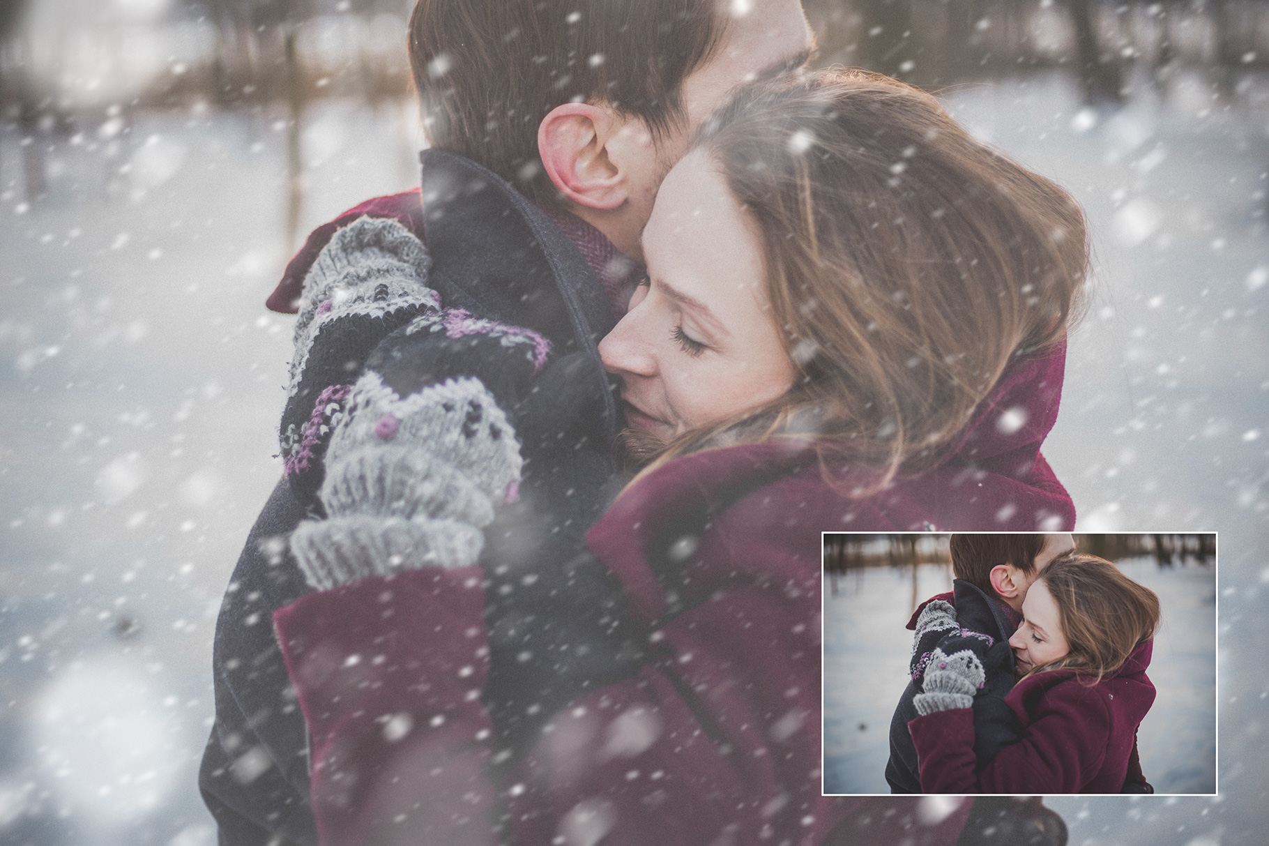
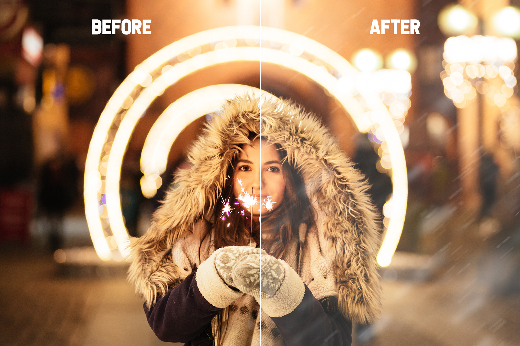
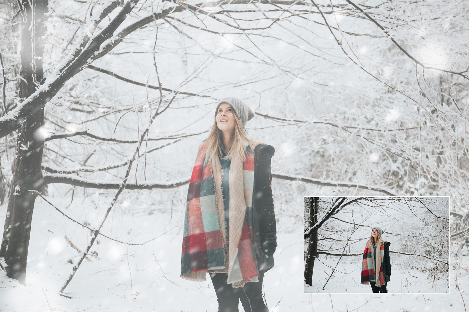
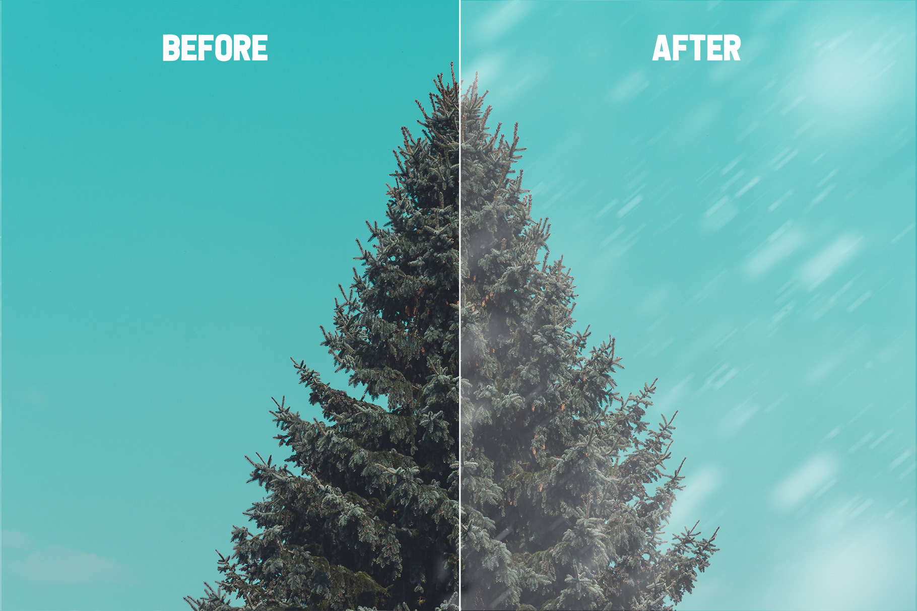
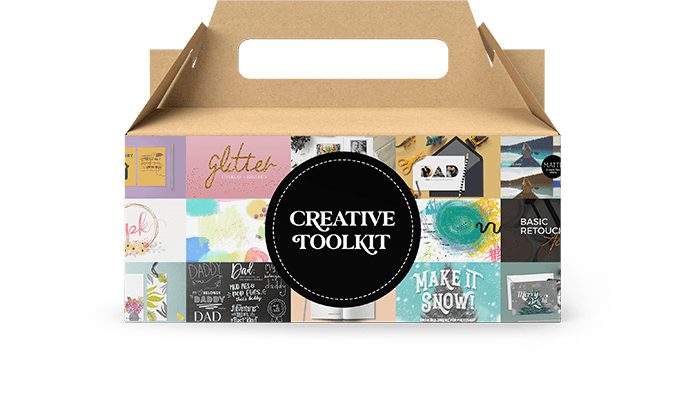
The other day, my work plans veered off-course and I ended up building this snow making toolkit, which turned out to be pretty rad, so I decided to share it. If you’ve ever wondered, “How can I add snow to my photos?” This kit is for you.

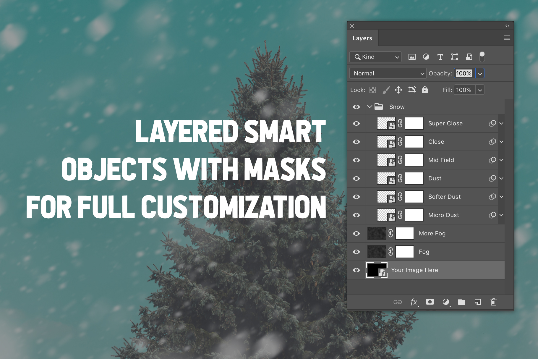
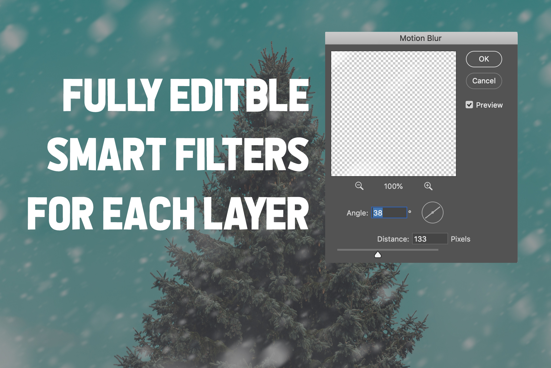
It has tons of flexibility for creating depth and realism with different snow effects separated by layers, each one a smart object with editable filtering applied.

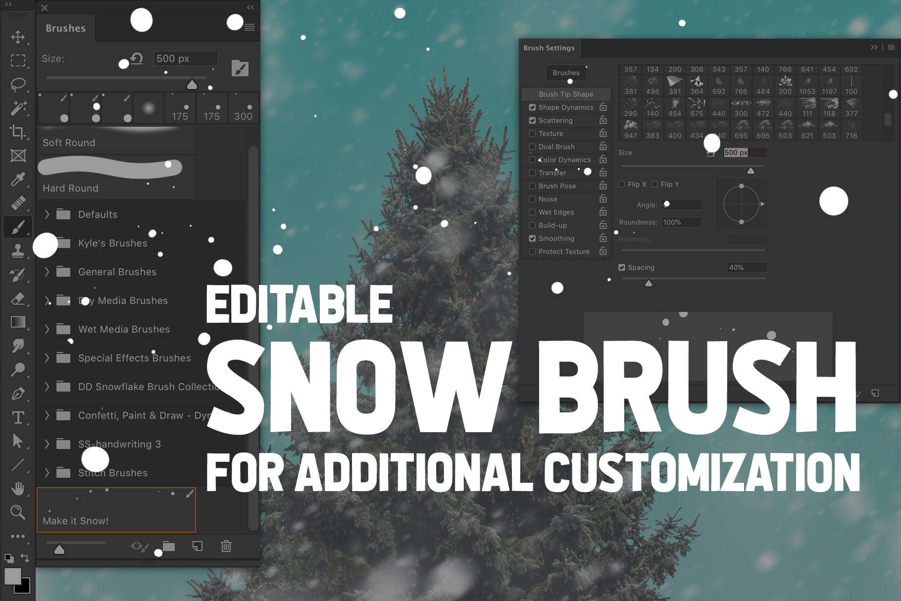
And if that’s not enough, I’ve also included a snow brush so you can hand paint snow precisely how you want it. (Tutorial video included, naturally.)

Grab your free toolkit and add some winter delight to your photos now!

Pregnancy Album and Diary Template

pregnancy-album-template.jpg

Back when I was pregnant with Zé, I kept a diary of photos and memories which ultimately culminated in an album/book of some sort. Naturally, I shared it on social media and has people asking for a template. I've just gone through and updated it for 2018 and added it to my shop. These are the details:

Features

  • 86 drool-worthy pages including an intro/outro, birthday spread, and a full-spread per week (x 40 weeks)—but don't feel like you have to fill in every week! Feel free to edit as needed!
  • Totally editable! Add/subtract pages, edit fonts/colors/layouts—whatever!
  • Don't want to use Blurb? Just adjust the specs to fit whatever vendor you want and get to it already! (Out of the box it's formatted for a 7x7 hardcover book from Blurb.)
  • THIS IS AN INDESIGN TEMPLATE. It is saved as an .idml file, so it can be opened with versions as far back as InDesign CS4. (If you're looking for a Photoshop template, stop and ask yourself, "Why would I design an 86 page document in Photoshop? That'd be crazy! I should know better than to even consider that!" Then, return to your senses and proceed with InDesign.
  • Includes an InDesign Library file with all the icons for each week making it super easy to rearrange/add/remove pages and drag-and-drop design elements as needed. (Instructions included!)

Tips for Easy, No-Stress Diary Keeping:

  1. Write as Much (or as Little) and as Often (or as Infrequently) as You Feel. Just because a template (this template) includes a spread for each of 40 weeks—doesn't mean you have to make an entry every week! I found pregnancy to be the most challenging thing I've ever put myself through, and as such, if I had tried to force myself to journal every week, it would've been a recipe for failure. I didn't even make my first journal entry until week 13 after we heard the heart beat, and that's totally ok. From that point on, I only made entries when I felt like I had something worth sharing with baby. Sometimes that was several times per week, other times there were 4 or 5 weeks between entries. Do what works for you and add/subtract pages as needed.
  2. Keep it Real. You don't have to fill the diary with flowery prose about rainbows, unicorns, and perceived pregnancy bliss (because let's face it, pregnancy can be hard). Write about the day-to-day happenings, how the plans for the nursery are coming along, or even current events that are on your mind.
  3. Use Tools That Make it Easy. Maybe you'll want to make your entries directly into the template in InDesign. Or maybe you want to get it out first, before worrying about making it pretty (that's what I did). I used Google Docs to make my entries (even adding small images to remind me what images I wanted to include), letting them pile up for months before I transferred (copy and pasted) everything to InDesign.

Just remember to keep it simple—pregnancy can be hard enough on its own. Hang in there mama!

Design Inspiration with Creative Market Freebies

creative-market-inspiration-freebieCheck out this darling print design made with assets from this week's Creative Market freebie downloads! Pick up the Happy Bees and Scandinavian Christmas Pack files for free now through Sunday. And if you're loving the hand letters script font shown here (the text says, "may your days"), it's called Loveluck, and it includes a collection of gorgeous swashes (shown here as the swirl leading in to the letter "m"). It's part of the incredible Hand Lettered Fontbox Collection that has quickly become many of my go-to favorite fonts. And it's currently 90% off!

There's still plenty of time to make beautiful things for the holidays, but don't wait too long! Grab some hot chocolate, light up the fireplace, and settle down with your favorite tunes and a pile of pixels. xoxoxo

The Enthusiast's Guide

New Book! Enthusiast's Guide to CompositionGreat news for shutter bugs everywhere, my good friends at Rockynook publishing have put together a series of books specifically for beginning photographers called The Enthusiast's Guide. It includes books on creating multi-shot techniques by Alan Hess, a guide to portraiture by Jarod Fosters, and a book on composition from yours truly. The series will be released this October. Good things to come!

Behind the Shot: Halloween

finalIn celebration of Zé's first Halloween and the lumberjack hat/beard I crocheted for him, I put together the above graphic and thought it'd be fun to share how I made it.

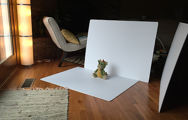
To accomplish the clean white background, normally I would shoot on white seamless (lit to delicious pure white perfection), but my studio gear is currently packed in moving boxes (yes, still), and I didn't want to mess with setting up hot shoe flashes, so I put together this low-tech and super easy solution using only available light (and set-up took all of 30 seconds!).

I photographed him on 30x40 white foam board (sold in a 10-pack which is GREAT because they are handy for so many things!), sitting about where you see the dragon in the photo below. I used one piece for him to sit on, another behind him (propped up by a basket), and a third piece opposite the window to bounce the light and fill in some of the shadows. You can see the set-up in the photo below.
setup

The photo below is the result straight out of camera (SOOC). Because I was using only available window light coming from the front/left, I wasn't able to blow out the background by over exposing it the way you easily could in the studio. Thus, we can see the seam where the floor board meets the background board, requiring a small adjustment. (And, that's our wood floor peeking out from below the foam board at the bottom of the photo.)
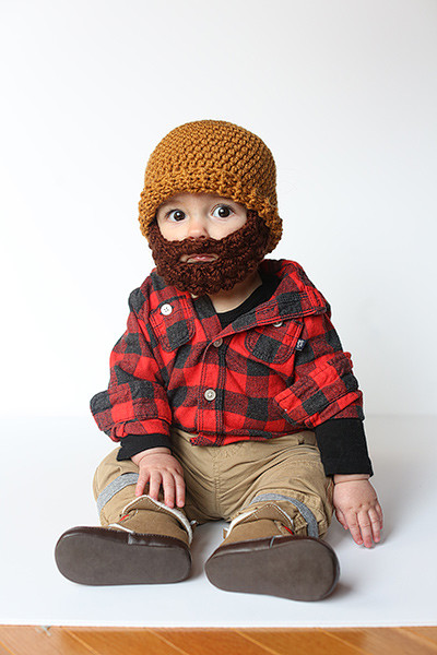
sooc

I used the Dodge Tool (O) to clean up the background, paying special attention to the seam where the two boards come together. To fix the floor, I used the Eye Dropper (I) to sample the white near the bottom of the foam board and the Paint Brush (B) to simply paint over the wood floor.
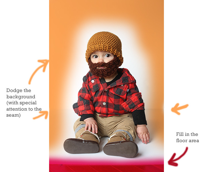
touchup

Working with white backgrounds can be tricky when you're not shooting them in the studio. Dodging can make things appear to be in order, but if you view the image on various screens from certain angles, you might see your brush strokes. To prevent this, I like to add a temporary Levels Adjustment Layer which I purposely destroy with a severely exaggerated midtone adjustment, which shows me any spots I may have missed with the Dodge Tool, as seen below. To fix any errant background information, I simply dodge the background layer while the Levels Adjustment Layer is still active, effectively checking my work as I go. When I'm finished, I drag the adjustment layer to the trash.

touchup2 Once the background was cleaned up, I used the Eye Dropper Tool and Option/Alt clicked to load the white background color as my active background swatch. Then, I switched to the crop tool to resize the whole image. (You can leave the settings blank and just drag from the corner to visually adjust the canvas area, or enter specific dimensions if you know what size you want the final piece to be.) Photoshop will fill in the canvas area with whatever color you sampled for your background swatch when you Option/Alt clicked with the Eye Dropper. This makes it possible to use the crop tool to essentially reformat the image and extend the background, creating room for our design. If you did a good job of cleaning up the background area, it should appear seamless.
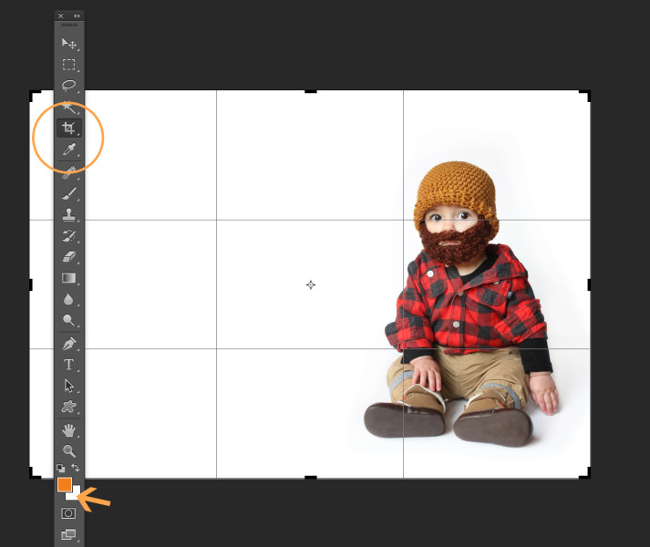
crop

To create a more organic feel, I opted to add some paper texture to the design. You can use any kind of texture file you want. I used paper48.jpg from this Give Me Some Papers Quick texture collection by Nicky Laatz. After making sure the texture file was sized appropriately for my image, I dragged it into the composition and changed the layer's Blend Mode to Multiply.
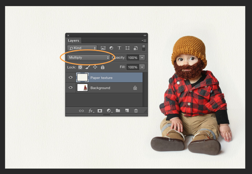
texture

Next, I added two text layers using Monster and Rockwell typefaces and used the Eye Dropper Tool (I) to select the text colors from within the image itself. Finally, I added the spider web graphic (again, changing the layer Blend Mode to Multiply) to finish the design.

final And that's it—frightfully simple!
Get This Book and Learn to Use Your Camera. Finally.

Whether you have a shiny new camera or an old battle scared one, learning how to use it (I mean really use it, not just crossing your fingers and shooting in auto-mode) is guaranteed to change your entire photo-taking life. Going from snapshots to great shots is a whole lot easier when you have some help. And it just so happens that Peachpit Press has a whole series of books to help you do just that—literally. A couple years ago I wrote Your Camera Loves You: Learn to Love it Back. I'm proud that it's been repackaged to fit within the Snapshots to Great Shots series, featuring the new title, Getting Started in Digital Photography.

Same great content, apt new title. (And cover). Yes, that's my adorable nephew and brother-in-law on the cover. Aren't they cute?

Get it. Love it. (Then—for bonus points, write a review about it. Emir loves to track that stuff, and it's sad to see a book with little to no reviews! ;)

Happy picture making!

xoxo

Getting Started in Digital Photography

Tackle Album Design Like a Boss

Alright people. It's a new year and wedding season will be upon us shortly (or may be already—depending on what part of the world you're in). The time to get a grip on your design/production workflow is now, before you get bogged down and fall behind, promising yourself you'll do a better next year.

If you're headed to WPPI next week, join me at 3pm on Wednesday for Wicked Fast Albums and get a grip on the chaos once and for all! I'll show you the basics of InDesign so you can rock not only albums (in record time), but studio marketing materials, ebooks, and even ipad apps! (What?!) For real.

And, I have a ton of great prizes from folks like Adobe, MpixPro, Finao, AsukaBook, Triple Scoop Music, Adorama, Kelly Moore Bags, and of course—Peachpit Press, RockYourWorkflow, and Banti Album Proofing.

Plus—free hugs to those who need 'em. Let's do this! Who's with me?

Thirst Relief Mentor Auction

I'm honored to be participating in Thirst Relief International's annual Mentor Auction again this year. If you're not already familiar with Thirst Relief and the amazing work they do, prepare to be blown away.
Their mission is to "overcome death and disease resulting from the consumption of contaminated water by providing safe, clean drinking water to those in need around the world."

Founded in 2005, Thirst Relief operates in nine countries to launch sustainable water projects in impoverished rural areas and urban slum communities.  100% of public donations go to their various water projects and amazingly—$5 provides 25 yrs. of clean water for one person.

Want to get in on the action and give yourself something to feel really great about? Make a donation to one of their projects —OR— get your bidding on to win a 90-minute mentoring session with yours truly (along with a copy of my Wicked Fast Wedding Workflow Guide and my InDesign Tutorial Video)!

Check out this video to learn more about the work they do, then feel awesome while you set the auction bids on fire! I'm looking forward to connecting with the highest bidder!

PS: Better hurry!  Bidding closes Sunday night (Feb. 3rd) at 10pm CST!

Thirst Relief Short from Anton Lorimer on Vimeo.

How to Turn Your Instagram Photos into a Custom Printed Book

*** This post has been updated to make it even more awesome! *** Let's be real.

I appreciate scrap booked labors of love as much as the next gal, but honestly, if my future (yet-to-be-conceived) children are to have any chance of having their memories live on in an analog format, I can't carry on with the fantasy that someday I'll make scrap booking a regular part of my life. Maybe for a special gift, but definitely not a monthly/yearly thing.

Thankfully, I found a painless alternative.

I've been stewing about how I can make it easy to make sure that our family memories (and bits of daily life) have a life beyond a dusty ol' pile of hard drives.

(This is one of my favorite What the Duck comic strips by the genius Aaron Johnson)

I generally recommend that each time you download photos (whether from your phone, or your "real camera"), pick your 10-20 favorites and order some prints. When they come, just drop them in a photo storage box. Getting fancy with glue and scissors is nice, but totally not required.

Of course, if you're like me, as diligent as I am with taking care of client images, when it comes to my own personal photos—I'm lucky if I download them 3 or 4 times per year. In fact, I've gotten to the point where—like lots of folks—most of the time, the only camera I have with me is my phone.

And the most action my personal photos ever see is if they happen to get posted online via Instagram, etc. So it made the most sense to find a way to make a book from my Instagram images.

And since sifting through my entire photo collection in search of the images I happened to post to Instagram is not likely to happen (like trying to find a needle in a haystack), I was on a mission to find a better way.

Enter Blurb. There are a lot of book-making solutions out there (especially when it comes to Instagram and other social photo sharing sites), but many leave much to be desired in terms of design flexibility, ease of use, and product quality.

Having been a Blurb fan for years, I already knew that I wanted them to print my books, but the online tool they provide for printing your Instagram images has some sort of bug that jumbles the images out of order if you try to add more than the default of 52. And since I was planning to include roughly 250 images, this was a serious concern. (This is really too bad, as otherwise this tool would be so great!)

Blurb also makes a book plug-in for Lightroom, but after playing around with it for awhile, though the interior page layout options had what I wanted (a single square image per page), I found the cover layout and material options to be limiting (compared to the choices Blurb offers elsewhere) and ultimately I wasn't able to cobble together the book in the specific way I wanted. So, I turned my attention back to Blurb's free desktop application (called BookSmart).

Here's the Step-by-Step

  1. Download your photos from Instagram. You can use something like InstaArchive to download a .zip file of your entire collection. After you make your first book, I suggest creating a recipe with IfThisThenThat (IFTTT.com) so you can have your instagrammed images sent to your DropBox Account where they'll already be waiting for you in a nice organized folder (this is my favorite method). Unfortunately, they'll only be sized to 612px x 612px. Don't panic. We'll deal with this in step 3.
  2. Sort and renumber the files. Use Bridge or Lightroom (or whatever works) to renumber the images. They should already appear within Bridge in chronological order, but if with long goofy file names, there can sometimes be problems with file order, so I always make sure to renumber.
  3. Batch upsize them. Bummer that the archived or DropBoxed images from Instagram are so low res. (it will be ok, breathe!) Use a quality plug-in to scale them up without tearing a hole in the universe. I use Alien Skin's Lightroom plug-in called Blow-Up (they have a free trial as well as a verion of the plug-in for Photoshop). I size my images big enough to print 4x4 @300ppi (1200 x 1200 pixels).
  4. Decide on a page layout. Choose one of the existing layouts in Blurb's desktop application and drop in your images. Or, for more control—build your own layout.

    I wanted a single image per page with plenty of white space around it, so I wrote a Photoshop action to build out each 4x4 image with a nice white background to fill out a 7x7 page. You can write your own, or download my custom action here (for a 7x7 book). Then batch run the action on the whole folder via Bridge.

  5. Design a cover. You could use InDesign (recommended), Photoshop, or do it directly in BookSmart (Blurb's free desktop application). I'm a control freak who wants a consistent cover design for all my books, so I designed accordingly (using InDesign) and will swap the images (and colors) with each "edition." I also included a place for volume/date information to note the time span for each book. For example, Vol. One reflects the fall of 2011 through the spring of 2012. Additionally, I included a photo of both Emir and I on the back to quickly document how we change over time. In the future, that image be a whole family photo. If you have InDesign CS4 or newer, you can download my front/back cover InDesign templates here. Drop in your own photos, edit the text, and export to jpg.
  6. Put it all together in Blurb's BookSmart. It's easy to load the photos, select them all, then drag and drop onto the first blank page and you'll see the rest will auto-complete, building your book in minutes, no matter how many pages you have. (Their limit is around 284 pages or so, so if you have more than that, plan to split it across multiple books.)

Enjoy!

 PS: Save 20% on your Blurb books through Dec. 8th with the code ANY20